Redesigning a healthcare app’s booking system to emphasize with users.
Baker Health
An innovative mobile app poised to revolutionize healthcare, providing patients with a streamlined platform to connect with healthcare providers effortlessly. With features including virtual consultations, appointment scheduling, prescription management, and secure health record storage, all conveniently accessible from the palm of the user's hand.
www.baker-health.com
My role
Product designer
Team
Product designer x1
Software engineer x2
External stakeholder x1
Contributions
Research, Information architecture, prototyping, design system contributions, and user testing.
Timeline
6 months
When
2023 - 2024


Problem
Booking an appointment to see a practitioner is the bread and butter to healthcare apps. Regrettably, the current system is clunky, outdated, and fails to meet modern user’s expectations of how an app should perform. Which results in low user satisfaction, and decreased app adoption.
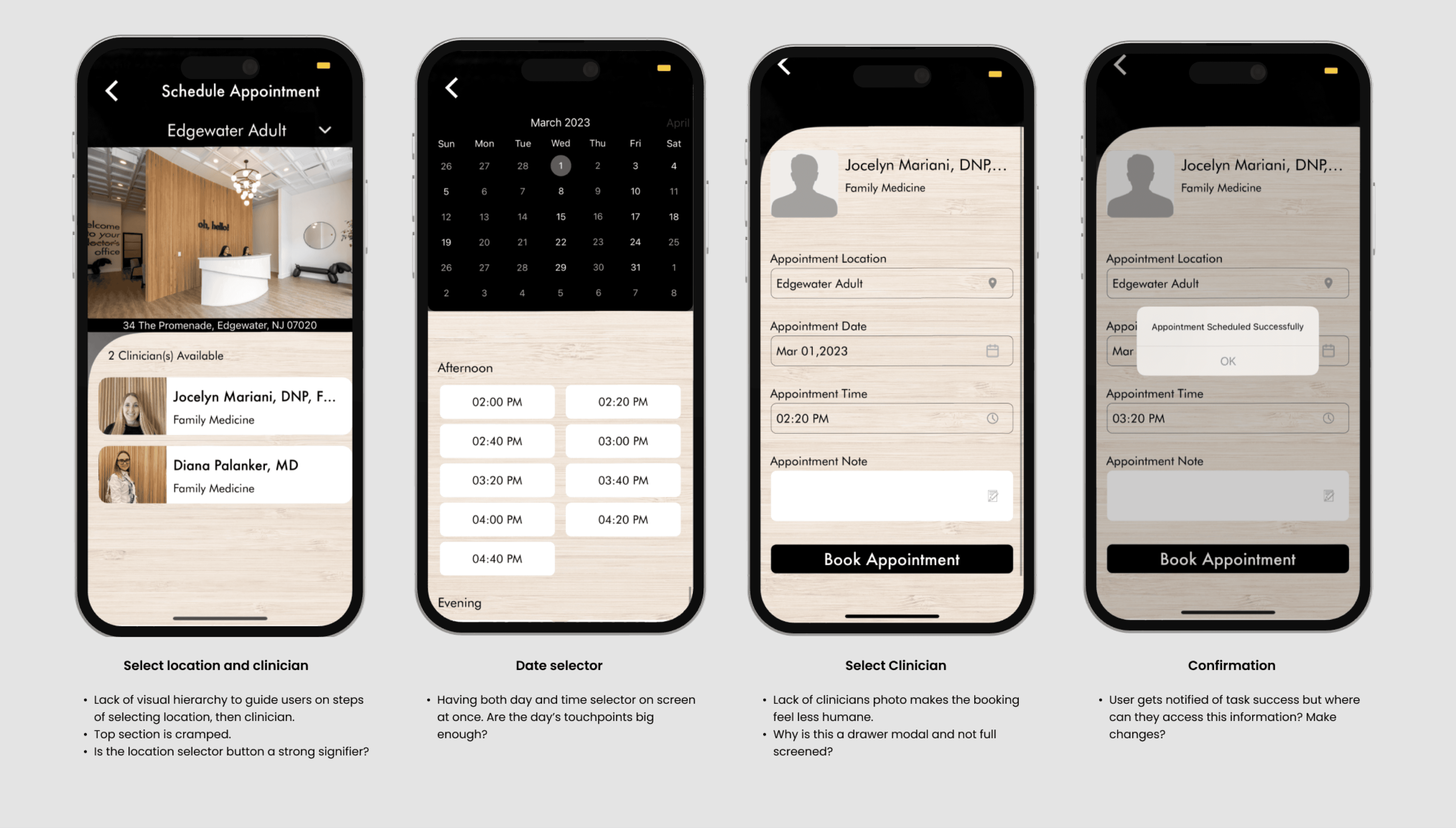
Current Design
Before the redesign, patients using the Baker Health App often found themselves confused and frustrated. The app's layout was complicated, making it hard to find essential features that they need.
I conducted a usability review and jotted down areas of improvement.
Objectives
OBJECTIVE 1
Increase user satisfaction.
In today’s heavily competitive tech market, user’s expectations have continuously grown with constant exposure to high profile apps. How can we meet the modern user’s expectations of how an app should function.
OBJECTIVE 2
Increase adoption rate.
There’s an app for everything nowadays. How can we leverage this feature to help users feel they truly need this app to solve their needs?
Research
I interviewed and spoke to a handful of users to understand their use-cases and struggles.
PAIN POINTS
Long wait to see a doctor
Whether its trying to book an appointment, or sitting in the clinic. Users reported difficulty seeking help.
PAIN POINTS
Feeling disconnected and inhumane
The process can feel ambiguous and cold.
PAIN POINTS
Hard to keep track
Users reported difficulty finding their appointment details. Resorting to calling the clinic to find out, or reschedule their appointment.

Product Requirements
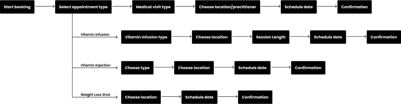
In conjunction to the redesign, I had to account for new features being added to this flow. Users could not only see a doctor, but also book practitioners for vitamin infusions, vitamin injections as well as weight loss shots.
User Journey
With integrating the new features, I restructured the user’s journey for the booking system. Adding in 3 different pathways for the user to complete a booking.
I worked on a new journey map to display the possible routes. I collaborated with the engineers to figure out what is feasible.
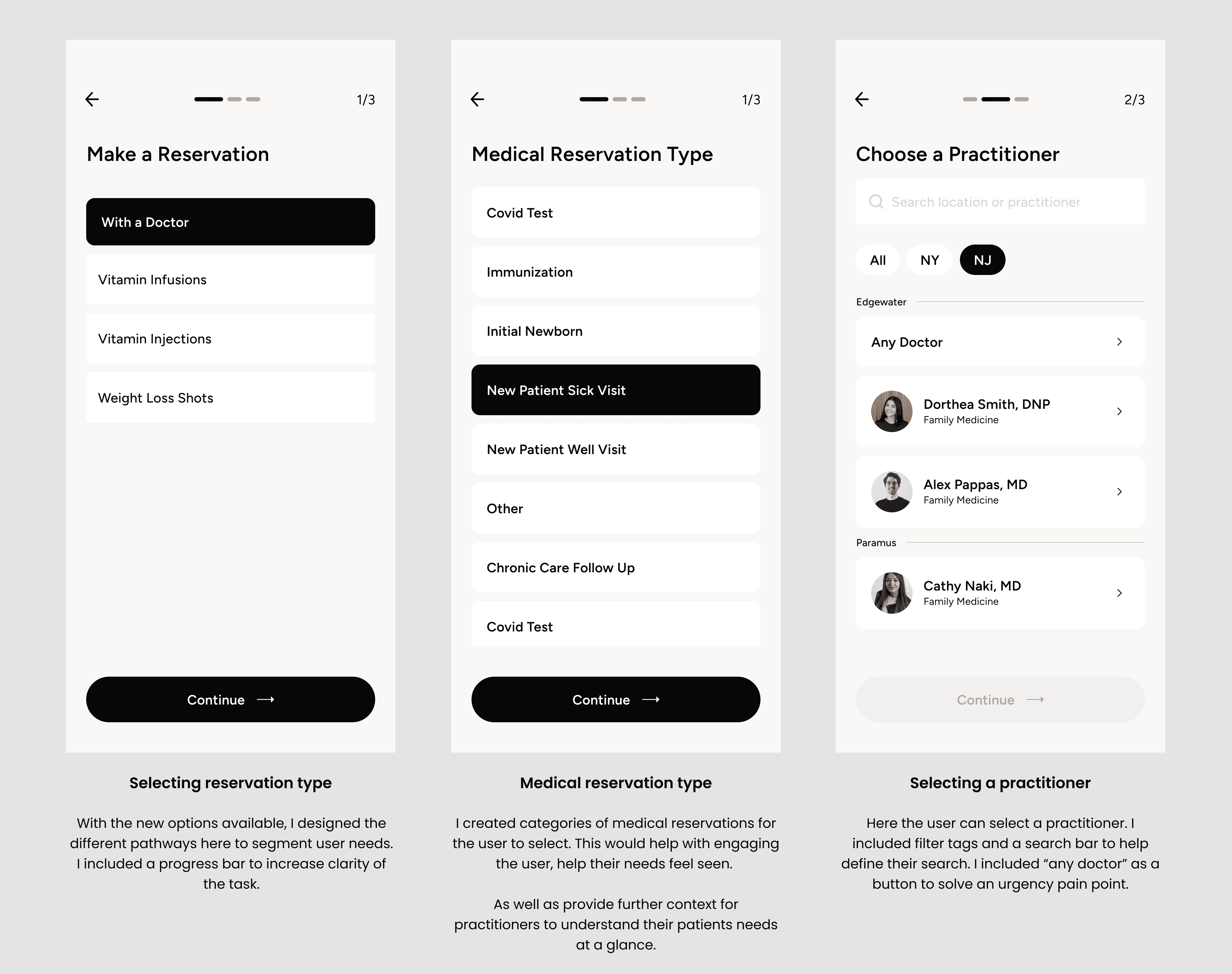
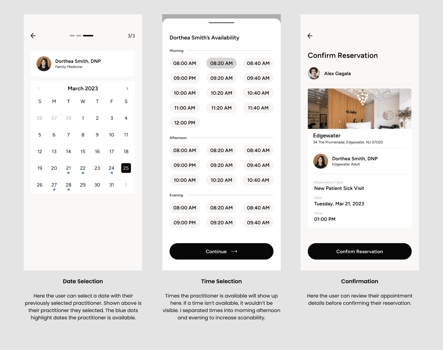
High-Fi Mockups
Seeing a Doctor
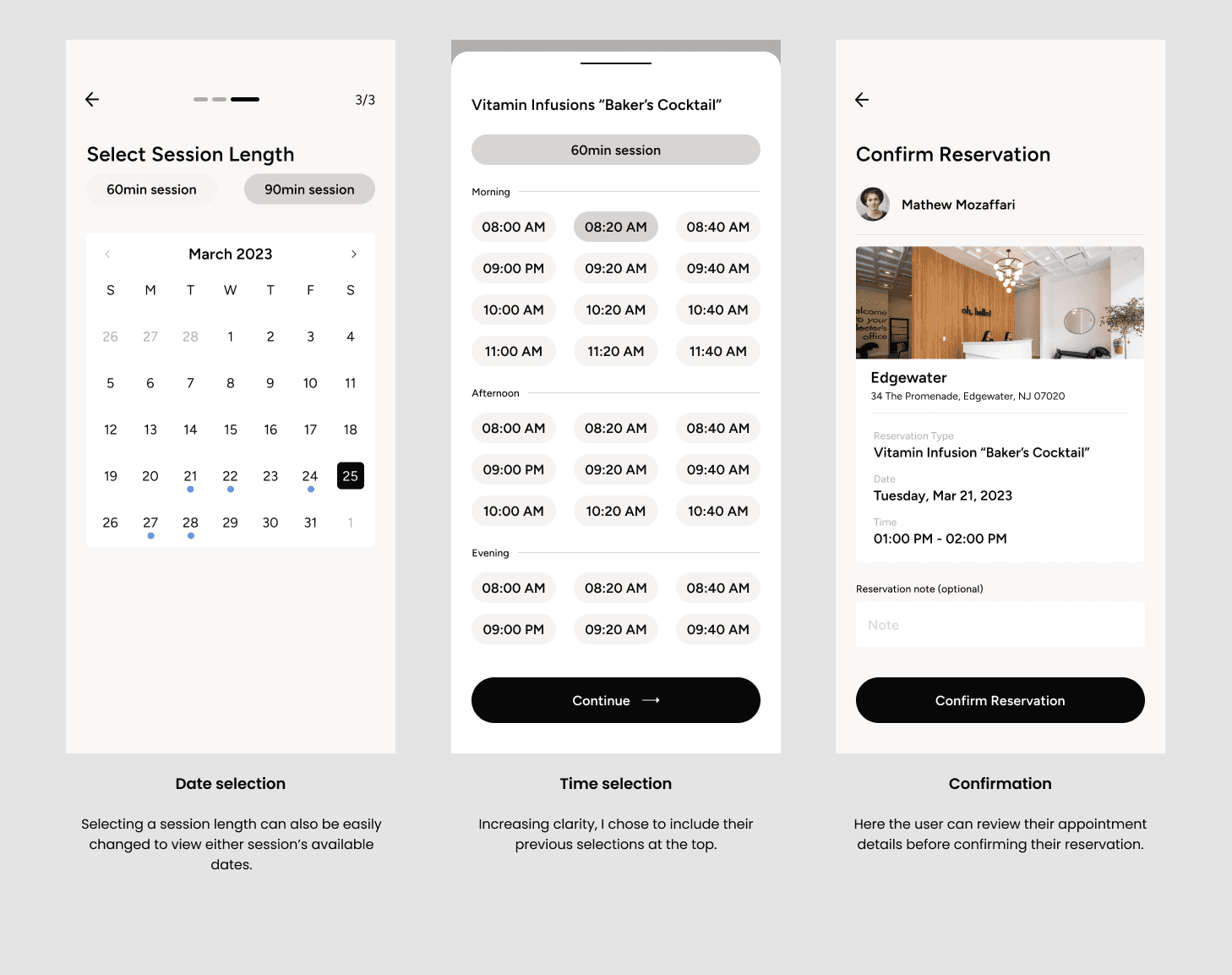
After conducting enough research and getting an idea of how the architecture is laid out. I jumped straight into designing a MVP to test my theories. The screens below detail the steps a user takes to complete a booking for a practitioner.
To help the process feel more humane, I opted for the naming convention of making a “reservation” rather than appointment.
High-Fi Mockups
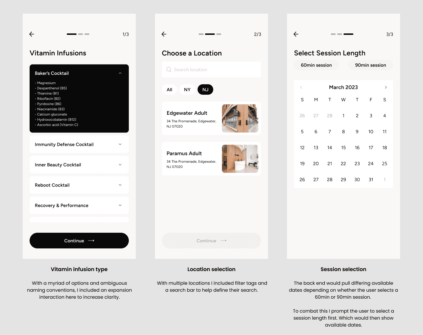
Booking a Vitamin Infusion
Following a similar pattern as seeing a practitioner, the vitamin infusion flow had its own nuances in infusion selection, location selection, and session length selection. I was able to reuse a lot of the components from the medical reservation type here.
High-Fi Mockups
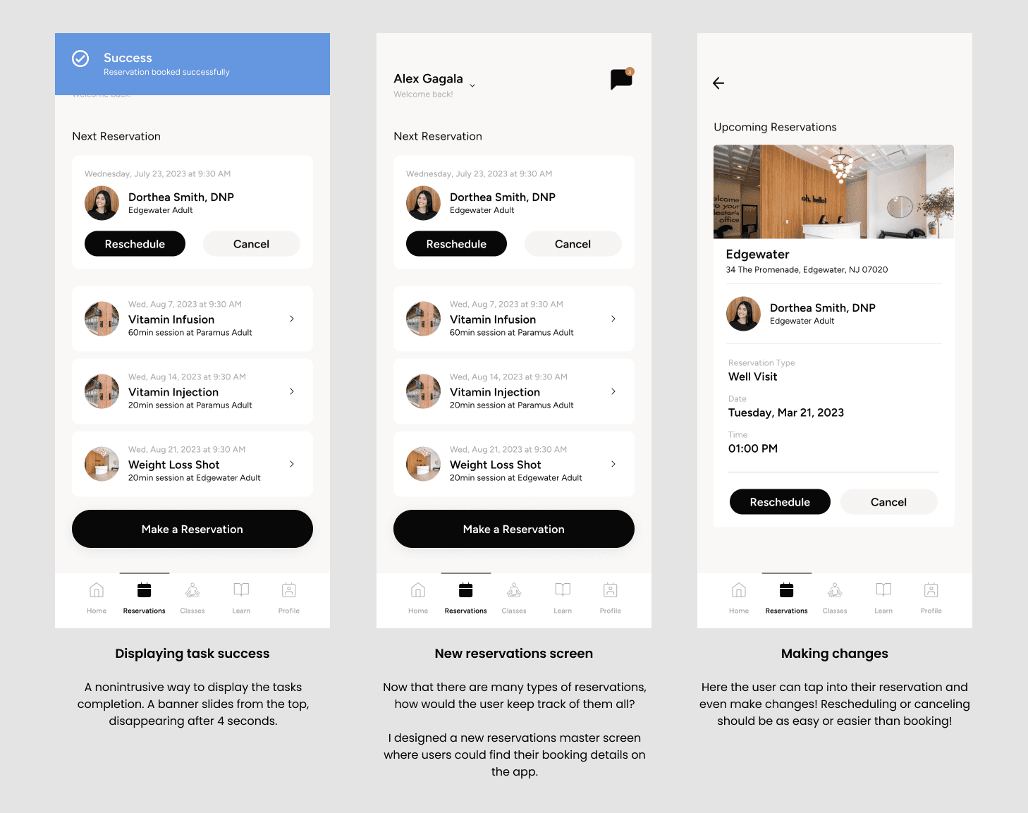
Reservations
Things I had to tackle in the redesign also consisted of how do we notify the user once the reservation is successful? Where can the user expect to find their booking details?
User Testing
What’s design without testing them for proof? I conducted tests with users to validate my solutions. I walked through the prototype, asked users to complete tasks, rate their experience, and overall could they see themselves using this app?
TESTING RESULTS
75% Increase in user satisfaction
TESTING RESULTS
90% Task completion rate
TESTING RESULTS
85% of users say they would keep the app
“The process definitely feels less messy and I have a sense of what to do. It overall feels a lot more organized and I can’t seem to anything I dislike”
- Comment from one of the users
Results
Other areas of the app were redesigned before the launch, many of which I worked on as well. Other features included in the redesign are: chat, classes, member registration and more. Following the launch these were the metrics that were tracked.
41%
Improved patient doctor relationships
33%
Increase in subscriptions
5,000
An increase of over 5,000 monthly active users
What’s in Store?
Future iterations include fine tuning current redesigned features, scaling with new additions to current flows, as well as new features being added into the app!


